Wednesday, November 30, 2011

The most wonderful time of the year

Wow. 2011 has flown by. We can't believe we are 1 day away from December! After a week of stuffing our faces in our respective Turkey Day locations (Jen was in snowy Denver, while I was in sunny Orlando --You can't get more opposite than that.) we are back on track and getting ready for the upcoming holidays. To kick off the holiday mailing season, we just added our new Christmas and Hanukkah paper goods to our etsy shop. Each card is hand-fed into our trusty C&P letterpress and, of course, have our customary Farewell "flare".

You can purchase our lovely little cards and gift tags through our website or in our etsy shop.


Monday, November 21, 2011

Toddler Twins: Cute Any Way You Look At Them

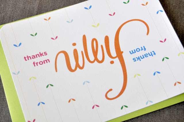
Okay, folks. Let's get down to the brass tax. Toddlers are cute. Twins are cute. Toddler twins? I can't even handle. It's no secret, we love us some cute kids here at FP. I've pretty much stopped caring about my friends with kids as individuals. No more idle chatter about their work or interests or shows we both watch. Who even notices their haircut or that fun new pair of fall boots. Nope, I just open cold with, "Let's see 'em. Pics. Of your kid. Now." And when the little people with big cutes are actually IN MY OWN FAMILY, it's just that much harder not to squish them until they cry "auntie." So when my brother-in-law Ted and his wife Erin asked us to do thank you cards for these 3-year-old cuties, we knew we had to make them special.

In the consultation, Erin said she just wanted something fun and different for them. Oh yeah, and colorful. I asked her if she was in the "twins are people too" camp and wanted do separate cards for each of them. She chuckled like only a busy mom of twins could and said maybe when they're old enough to actually each write their own. Until then, she'd stick with one streamlined thank you from the both of them.

In the spirit of Erin's efficiency, Lisa and I began to brainstorm fun ways to make one card do the work of two. We toyed around with some ideas for a gatefold, a 2-sided postcard, maybe something circular. Then, Lisa remembered seeing this gem. Not really the kid-friendliest concept, but hey, you can't fight true inspiration. The brainstorm sesh went thusly:

"What is this even called? An anagram? Palindrome?"
"It's called an ambigram."
"wtf is an ambigram?"
"It's that. It looks like one word and when you turn it upside it's another word. The words are flippy."
"That the technical definition?"
"Yes. Ambigram: the words are flippy."
"It's cool. Too bad we couldn't do it for Finn/Riley... Could we?"
"No way.
"Not possible."
"Maybe?"
(Short silence, just fervent sketching...)
 "You'd have to make the y long like an f..."
"The n would have to drop down for the l..."
(More sketching...)
"It's so close, but I'm stuck on the double n. It's not working for the—"
"I think I got it! I got it!"
HOORAY! Our first digital pass went something like this:


No less than 3 hours and 50 files bounced back and forth, tweaking tiny little swoops and curves and refining every stroke, we finally landed on this BAM!bigram. (That's what I'm trying to call it. I'm so far alone in this.)


 Wait a second...


Yup, that's right. Bam!bigram. We just can't decide which side we like better.

All upside-down meeting aside, we're super happy with the way these turned out. We've even considered starting a line of custom ambigram cards. But then we thought about all the Elizabeths and Tims getting married out there and figured we should just relish this one awesome ambigrambial triumph.


I'm in the snowy Rocky Mountains for the holiday week with my husband's family, and yes, Finn & Riley are still just as squishy as ever. I, for one, am very thankful for all the cutienutballheads in my life.

Have a happy Turkey Day, everyone. Safe travels and lots of gravy and kid cuteness to all.

} jp-c


Thursday, November 17, 2011

Font Failure

We're not one to share our failures with our fans. We like to look buttoned up and professional with our clients, and let's be honest, who wants to really hear about our mistakes? But for those of you who enjoy our typography postings, we decided it's best everyone know about our little "oops" so they don't make the same one. We'd like to preface this post with a disclaimer: Our font failure isn't that bad. I'm sure plenty of you will read this and think, "Big deal. So What? Who cares?" But we'd like to think our typography skillz (yes with a z) are pretty snazzy. We take pride in our font choices, so we apologize, in advance, to our graphic design friends.... this may hurt your eyes.

(Back Story:) A recent client of ours sent us pictures of her adorable boys for a custom holiday card. Her kids are RIDICULOUSLY cute. We cannot stress that enough. Just to prove our point, here is their Halloween picture:
 (Sorry the pictures was kind of blurry from Facebook. Common this is cute, right?)


 We had created a card for Katie the year before and her pictures did not disappoint. We designed this sweet ditty that everyone really loved. The kids, look charming, the card is heart-warming and it's the perfect holiday card to send to friends and family:


(Side Note:) Sooo my best friend is Katie's sister. She had asked to see the card options to give her opinion to her sister. I had sent all the designs and then threw in this one as a joke. It didn't quite make the cut for obvious reasons:

{Outside}


 {Inside}


 Well unbeknownst to me, this reject was sent to Katie as well, but Katie actually really liked it and wondered why we didn't it as an option in the first place. So this year she asked for a more whimsical holiday card that leaned toward the snarkier side. Once again, we received more adorable pictures of the boys. This time they were riding on a friend's boat during the summer. Life jackets, wind blowing in the hair, captain's hat - it all screamed "nautical". Which led us to this font, Salty Dog:


 Perhaps in the right situation this font wouldn't look so bad. To be honest, I'm not sure what we were thinking when we purchased it. Fun - check. Whimsical - check. Hard to read - check. The font was just a failure right off the bat. It looked chunky, and disproportionate. When in the color red, it looks like a candy cane. (An idea for a holiday card??) So we ditched the font.


{For those of you who would like to purchase it, you can find it on myfonts.com No judging. We promise.}


To our advertising/ design friends: Yes, we know from design school to stick w/ the classics. Kitschy fonts are just that, kitschy. Don't purchase frivolous type that you'll only use for one project. Perhaps knowing the rules, we thought we could break them, but that kind of backfired.

In the end, we ended up using a much simpler font, clarendon. Here's a sneak peek of the card. We don't want to spoil it for the client, so we'll post about the final design soon.


Lesson learned? 1) We'll probably stick with our classic fonts and be a little more hesitant before purchasing such a distinct font. 2) We lost $30 down the drain. 3) We have a bad-ass candy cane font that we'll use for holiday cards next year.


Tuesday, November 8, 2011

Inspiration Day: Holy Jackson Hole!

I've always wanted to go to Jackson Hole. I hear it's a gorgeous place with beautiful snow-capped mountains and clear blue skies. The Grand Tetons are one of the most photographed mountains in the US and were considered part of the gateway to the West.
{The top pic is a famous Ansel Adams print. Courtesy of nps.gov. The bottom picture is from shelamulican.com}


It's the kind of place I'd want to pull a City Slickers and get all countrified for a dude ranch "experience" or go there in the spring to frolic around in all the wildflowers (though I don't think you can really do that since it's protected land, but I can dream, right?)  I'm not sure when I decided that I needed to put this majestic place on my bucket list, or when I'll actually make it there, but since I already experienced the Grand Canyon, and saw the gorgeous Redwood Forests, it seems Jackson Hole would naturally be my next go-to place to visit.

Luckily for me a client of ours is getting married in Jackson Hole this coming August and her wedding theme is all about the great West. We had blogged about Heather's Save the Dates before, but our designs never came to fruition because Hurricane Irene swept through the Caribbean and the bride and groom decided to change their destination to a more meaningful place where they got engaged - enter Jackson Hole. So, playing off of her color palette of blues, whites and reds, and using classic Americana fabrics Jen and I were able to create some lovely ideas for the new Save The Dates.

Obviously we aren't going to show you our ideas JUST yet, but here are some inspirational looks we used to help us create our look for the Save the Date.
 {I don't know why that girl on the right looks so angry. Photo courtesy of refinery29.com}


{Ooh la la, chambray. Photo courtesy of refinery29.com}


 {Classic Americana looks - Denim, cowboy boots and rodeos. Photos from abfits.com & etsy.com}

{Blue & Red Gingham on the left. Classic dark denim on the right.}
{Our color scheme}


We're sent the designs to our client today, so hopefully we'll be able to show you the chosen Save The Date when we finish the design. In the meantime, we have been busy bees working on lots of other custom work, so we should be posting those soon. Keep your eyes peeled!


Friday, November 4, 2011

Crafting with Design Sponge


When it rains in Atlanta the city seems to stop, especially when it starts raining during rush hour traffic. Our already busy highways become even busier with people trying to race home and get out of the rain. I'm not sure why Atlanta gets so crazy when rain rolls through. Maybe it's because we've been programmed to withstand heat better than water, or maybe it's because the rain tends to bring colder weather . Whatever the reason, I guess I've become a true Atlantian because I, for one, tend to shift into the same "rain" mode as every other person here does. Get me home. Give me some comfy clothes. Pray there is a good movie on TV (perhaps Dirty Dancing?) and I'm ready for a night on the couch to weather the storm.

Last night I ended up making an exception to my norm. Grace Bonney from Design Sponge was at West Elm hosting a crafting / book signing event. Our good friend and blogging confidant, Molly, asked me to attend. I wasn't so sure about the crafting segment of the night, but thought it would be a fun opportunity to meet Grace and catch up with Molly.

Upon arriving, we saw there were several tables set up and each seat had 2 napkins, some paint, foam brushes, xacto knives and stencils. I wasn't sure what I was picturing when I heard this was a crafting event. I thought maybe we'd doodle something on a piece of paper, have a few drinks and call it a night, but this was actually down and dirty crafting.


Grace arrived shortly after Molly and I had sat down and began the instructions. We were going to make some kind of monogrammed napkin with the stencils and paint. It took her a few minutes to run through the directions, which seemed easy enough, but when we turned to our napkins and looked at our crafting tools, we had no idea what we were doing. Everything had gone in one ear and out the other. Apparently we weren't the only ones feeling the same way. Our whole table was staring blankly at each other, holding our xacto knives mid-air and asking each other what we to do. It would have been smart to to actually open the Design Sponge book and read how to create our monograms, but instead we opted for the classic high-school-test-move where you look at the next table to see what they are doing. Finally, Grace came over and explained to us step-by-step how to start our project and eventually we all got the hang of it. After stressing about the design we wanted to create, the cutting of our stencil, and what color paint we wanted to use, Molly and I ended up w/ somewhat successful finished products.

Yes, I chose a golden retriever stencil. I tried really hard to make it look like our boxer, Harley, but that just took too much time, so I took the easy road instead. 


Here are some quick shots during the crafting time:

The stencils for the project 


  My mad cutting skills

  
Quote from Molly "I wish Jen were here to do this for us." I concurred.


My finished dog. 


After the crafting portion ended, I had the chance to meet Grace and have her sign my book.


Grace was uber-nice to meet and we even discussed our Savannah weddings. (I'm such a dork). All in all it was a good night, even though it was rainy and cold. I guess sometimes it's worth it to actually get out of the house when it's raining.

~LGT

Tuesday, November 1, 2011

Seventy-Two Days


 Well we saw this coming, but not this soon. 72 days after their humongous, over-the-top, ridiculously spency wedding (that has been broadcasting all over E! 3 times a day for the past few months) the KK's are done. Over. Divorced. We truly did wish them well. But we kinda knew from the get-go that this marriage was not a match made in heaven. As you know, Jen and I are addicted to celeb gossip. We don't shy away from the fact that we watch E! News, read Huffington post just for the celeb section and scan people.com religiously. So it was no shocker that Jen and I knew about the breaking news pretty much right after it was announced. When the newlyweds got engaged we wrote a little ditty about their wedding and even gave them props for their fabu wedding invites. But with such a short engagement, camera crews following them around 24/7 and 3 very tight-knit sisters with a very overbearing mother, Kris Humphries had to have known what he was getting into.


 (Yes, that's Ryan Seacrest and Bruce to the right of the pic).


So, since we like to think we know Kris and Kim SO WELL we thought we'd do another rendition of our celebrity carding, where we divvy out our cards to our fav. celebs, but never have the guts to actually send them. For a fun little twist, we decided to not only give our two cents, but we'd also send Kim some love from her sisters.

Card #1 Khloe:  


Khloe is probably saying "I told you so" as I type this blog. She knew something was up and she even called Kris out on national television. We like her brazen boldness and we appreciate her honesty. Khloe will tell you like it is and won't apologize for her honesty. Khloe would give her sis our Suck It Up card.

Card #2 Kourtney:


Although we don't know if Kourt would ever give this card to Kris, we do know that our Hot Mess Card would sound like something that would come out of her mouth. In fact, we're pretty sure she would have given this card to Kim during her diamond earring freak out moment in Bora Bora... and then resend it to her after the wedding.


Card #3 Jen & Lisa:


Seriously. That was the first thing that came out of my mouth when Jen g-chatted me and said Mr. and Mrs. Humphries broke up. What the heck happened? Was it a publicity stunt? Was this not Kim's second wedding? Wasn't Justin Bieber there? Such ridiculousness. Obviously, the What's Up With That Card had to be our chosen design to send to Kim.


All in all, the whole wedding seemed to be such a farce and it kinda made us sad to see their marriage end so soon.  Being a part of the "wedding industry", we are constantly reminded that there there is such as thing as true love and people do find it every day. Unfortunately, Kim was a product of the wedding whirlwind where the actual ceremony becomes the center of attention, rather than the marriage itself. Maybe this will be a lesson to other brides out there who are in the middle of wedding mayhem. It's not about the cake or the flowers or even the size of your engagement ring. It's about building a life together, being committed to each other, and the wedding day is only the beginning of it all. (Alright, I'll get off my soapbox now.)


Monday, October 10, 2011

Ya'll Come Back Now

We love it when we have repeater custom orders. It makes us feel like a distant relative or family friend that gets to catch up every so often and hear what's happening in our clients' lives. More often than not it's a birthday milestone or a new baby that we get to celebrate and it makes us feel privileged to be called to do it time and time again for them.

We hit a new record this past week with a repeat customer. It was the third time we were creating a baby shower invitation for her. But what made it even more special was that the baby shower was for herself! The client's mom was helping with the party details, but Tracie wanted to make sure she we created the invitations. So of course we had to pull out the big guns to make sure her invitation was above and beyond her expectations.

We were told the baby's nursery had creams and browns with touches of pink and we could let our imaginations run wild with the design. The result was this little ditty- girly, graphic flowers with a lovely fabric and stitching detail at the bottom of the invite:


We had originally thought of using pink seersucker fabric for the bottom portion of the card, but were so glad we decided to switch it up last minute for the cream & pink stripe pictured above. It made the design feel a tad more classic and refined.  


We think Tracie will be pleased with the finished product. (If she hasn't seen the spoiler alert picture on Facebook already. Sorry Tracie!)

Wednesday, September 28, 2011

Gone to the dogs

Amongst all the hustle and bustle of moving into our new studio this past week, we had the pleasure of working on a fun project for an in-home pet care company. We're currently in the process of creating their business cards, but just finished their logo last week and loved it so much we thought we'd share it with you.


It's always interesting to see how ideas come to fruition, so here are the beginning sketches:


Which turned into these computer comps:


And resulted in this final logo. A lovely mix of the 2 designs above:


Our honorary mascot, Harley, provided great inspiration. We think he approves the logo :)