Showing posts with label custom cards. Show all posts

Monday, November 21, 2011

Toddler Twins: Cute Any Way You Look At Them

Okay, folks. Let's get down to the brass tax. Toddlers are cute. Twins are cute. Toddler twins? I can't even handle. It's no secret, we love us some cute kids here at FP. I've pretty much stopped caring about my friends with kids as individuals. No more idle chatter about their work or interests or shows we both watch. Who even notices their haircut or that fun new pair of fall boots. Nope, I just open cold with, "Let's see 'em. Pics. Of your kid. Now." And when the little people with big cutes are actually IN MY OWN FAMILY, it's just that much harder not to squish them until they cry "auntie." So when my brother-in-law Ted and his wife Erin asked us to do thank you cards for these 3-year-old cuties, we knew we had to make them special.

In the consultation, Erin said she just wanted something fun and different for them. Oh yeah, and colorful. I asked her if she was in the "twins are people too" camp and wanted do separate cards for each of them. She chuckled like only a busy mom of twins could and said maybe when they're old enough to actually each write their own. Until then, she'd stick with one streamlined thank you from the both of them.

In the spirit of Erin's efficiency, Lisa and I began to brainstorm fun ways to make one card do the work of two. We toyed around with some ideas for a gatefold, a 2-sided postcard, maybe something circular. Then, Lisa remembered seeing this gem. Not really the kid-friendliest concept, but hey, you can't fight true inspiration. The brainstorm sesh went thusly:

"What is this even called? An anagram? Palindrome?"
"It's called an ambigram."
"wtf is an ambigram?"
"It's that. It looks like one word and when you turn it upside it's another word. The words are flippy."
"That the technical definition?"
"Yes. Ambigram: the words are flippy."
"It's cool. Too bad we couldn't do it for Finn/Riley... Could we?"
"No way.
"Not possible."
"Maybe?"
(Short silence, just fervent sketching...)
 "You'd have to make the y long like an f..."
"The n would have to drop down for the l..."
(More sketching...)
"It's so close, but I'm stuck on the double n. It's not working for the—"
"I think I got it! I got it!"
HOORAY! Our first digital pass went something like this:


No less than 3 hours and 50 files bounced back and forth, tweaking tiny little swoops and curves and refining every stroke, we finally landed on this BAM!bigram. (That's what I'm trying to call it. I'm so far alone in this.)


 Wait a second...


Yup, that's right. Bam!bigram. We just can't decide which side we like better.

All upside-down meeting aside, we're super happy with the way these turned out. We've even considered starting a line of custom ambigram cards. But then we thought about all the Elizabeths and Tims getting married out there and figured we should just relish this one awesome ambigrambial triumph.


I'm in the snowy Rocky Mountains for the holiday week with my husband's family, and yes, Finn & Riley are still just as squishy as ever. I, for one, am very thankful for all the cutienutballheads in my life.

Have a happy Turkey Day, everyone. Safe travels and lots of gravy and kid cuteness to all.

} jp-c


Thursday, November 17, 2011

Font Failure

We're not one to share our failures with our fans. We like to look buttoned up and professional with our clients, and let's be honest, who wants to really hear about our mistakes? But for those of you who enjoy our typography postings, we decided it's best everyone know about our little "oops" so they don't make the same one. We'd like to preface this post with a disclaimer: Our font failure isn't that bad. I'm sure plenty of you will read this and think, "Big deal. So What? Who cares?" But we'd like to think our typography skillz (yes with a z) are pretty snazzy. We take pride in our font choices, so we apologize, in advance, to our graphic design friends.... this may hurt your eyes.

(Back Story:) A recent client of ours sent us pictures of her adorable boys for a custom holiday card. Her kids are RIDICULOUSLY cute. We cannot stress that enough. Just to prove our point, here is their Halloween picture:
 (Sorry the pictures was kind of blurry from Facebook. Common this is cute, right?)


 We had created a card for Katie the year before and her pictures did not disappoint. We designed this sweet ditty that everyone really loved. The kids, look charming, the card is heart-warming and it's the perfect holiday card to send to friends and family:


(Side Note:) Sooo my best friend is Katie's sister. She had asked to see the card options to give her opinion to her sister. I had sent all the designs and then threw in this one as a joke. It didn't quite make the cut for obvious reasons:

{Outside}


 {Inside}


 Well unbeknownst to me, this reject was sent to Katie as well, but Katie actually really liked it and wondered why we didn't it as an option in the first place. So this year she asked for a more whimsical holiday card that leaned toward the snarkier side. Once again, we received more adorable pictures of the boys. This time they were riding on a friend's boat during the summer. Life jackets, wind blowing in the hair, captain's hat - it all screamed "nautical". Which led us to this font, Salty Dog:


 Perhaps in the right situation this font wouldn't look so bad. To be honest, I'm not sure what we were thinking when we purchased it. Fun - check. Whimsical - check. Hard to read - check. The font was just a failure right off the bat. It looked chunky, and disproportionate. When in the color red, it looks like a candy cane. (An idea for a holiday card??) So we ditched the font.


{For those of you who would like to purchase it, you can find it on myfonts.com No judging. We promise.}


To our advertising/ design friends: Yes, we know from design school to stick w/ the classics. Kitschy fonts are just that, kitschy. Don't purchase frivolous type that you'll only use for one project. Perhaps knowing the rules, we thought we could break them, but that kind of backfired.

In the end, we ended up using a much simpler font, clarendon. Here's a sneak peek of the card. We don't want to spoil it for the client, so we'll post about the final design soon.


Lesson learned? 1) We'll probably stick with our classic fonts and be a little more hesitant before purchasing such a distinct font. 2) We lost $30 down the drain. 3) We have a bad-ass candy cane font that we'll use for holiday cards next year.


Friday, August 19, 2011

The little booth that could

Here she is. Our little booth. She's a beaut, right? After our crazy-hectic-running-around-getting our-shiz-ready-for-the-show-week we were ready to show off our booth in all of her glory. We called her Booth #1929 (only because that was our registered number in the show catalog, but that's besides the point). We birthed a really cute booth that we were really proud of.


Here is a smattering of our new cards. They're making their way to our etsy site, so be on the lookout for them! They are being added daily and should all be posted by next week.


So we had this fun idea for figuring out which cards the buyers were liking. We had about 20 different little jars to put beside our cards and whichever jar was the full of jelly beans at the end of the show, the buyers would get a discount on that card. Well, we learned a few things during this show:

1. Be sure to take into account the extra room the jars will take up on the shelf when planning out the booth. We had to take about 15 of the jars down because we didn't have the room for all of our cards! This led to buyers not being able to vote for a certain card they liked. Oops.

2. Buyers like to look and not participate in silly voting games. We thought it would be fun and interactive, but it turned out to be a bit of a flop. We got some people to vote, (thanks voters) but in the end, it wasn't as many as we had hoped. We weren't really worried about it though. Jen and I basically ate all the left over jellybeans anyway.

common, look how cute those jars are!


We had to take a picture of our orange ends! They look good, right?


Thing #3 we learned about tradeshows: People love free stuff. (we knew this already having a background in advertising) but we didn't realize how powerful a bowl full of jelly beans can be. People were making a B-line to our jelly beans and they weren't even a) buyers b)interested in our cards c) were buyers, but did not sell stationery. We were totally glad to give them away, though. Jen's dad bought us 3 huge jars at Costco and we needed to get rid of them. Especially since we were eating jelly beans for breakfast, lunch and our afternoon snack.


We also gave away jelly beans in little SWAG bags. Those were a hit!


Here were our business cards and catalogs stacked next to each other. We had a few comments about our cards looking like coasters. Maybe b/c they were in a stack?


Our catalog was letterpressed as well. We were so happy when people complimented us for our unique catalog.


....And this was us after the show. Ready to have a drink and relax and start thinking about the next gift show we are going to do.


Thursday, February 10, 2011

Wedding Invitations: Old Fashioned Lemonade

When Caroline and Matt came to us with this heart-warming theme for their spring wedding in Charleston, we gushed—literally, like a bushel of fresh-squeezed lemons. They were pretty much the dream couple to work with, letting us run with the color scheme of pale yellow with navy accents to do whatever our puckered hearts desired. And the ideas just started pouring out. Some of the inspiration for their custom suite:

found via pinterest
{ See the full board of inspired goodies here. }

Now, this wasn't our first rodeo on the Southeastern seaboard, you'll recall Lisa and Justin's own Savannah-nanza. But this is our first Chucktown invitation, and we were excited to work with a new, lovely color scheme. (Our new credo: no.more.green.) On our list for this charmingly Southern affair there were three must-haves: soft seersucker. heavenly florals. faux bois (Lisa's newfound fave...stay tuned for more on the matter).

We served up Caroline and Matt a pretty little letterpressed diddy that mixed a modern peony design and a classically elegant type treatment. Then we finished it off with a tall glass of pale yellow seersucker laced with a navy stitched border, all given that extra sweet touch with a faux bois bellyband.

Here's a look at the final pieces!


Delish. I don't know about you, but I can't wait to see the final event pics. Till then, a sweet cheers to you all!

} jp-c

Wednesday, January 19, 2011

The January Blues

January. The rock bottom of winter months. November and December are full of food, festivities and fun and then you hit January. Wham. All of the sudden you realize you're back to cold cut turkey for your sandwiches, and top 100 hits on the radio.

This January has been especially weary for those of us living in the south. The winter storm that hit last week paralyzed Atlanta for nearly 6 days.


Yeah, that's me skating across Peachtree Street.

And me breaking my "sled" on the really hard snow.


It's funny how a few inches of snow and too many hours on the couch can get me thinking about the holidays again. Maybe it's the nostalgia of growing up in the north or the fact that the holiday hustle and bustle is over, but as the tiny flakes slowly covered Atlanta, I found myself wishing our Christmas tree was still standing and our neighbors hadn't taken down their lights.

Jen must have had ESP because the day before the storm hit, I received a package of the custom holiday cards we had been working on. We were asked this year to create new custom holiday cards on top of the retail cards we had online and in Urban Cottage,Atlanta. We, of course, were excited and pleased with the outcome of these cards.


One card was for Jen's sister. Her super cute nephew was featured on it.


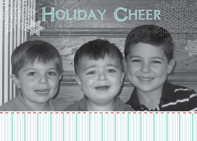
The other card was for my best friend's sister. Her three little boys are unbelievably adorable!


It was a nice surprise to get the cards when I did. The snow coupled with the unexpected mail made it feel like a mini Christmas all over again. Perhaps January isn't so bad. It's the month of last year's reflections and possibilities of this coming year. Who knows what 2011 will bring this year, but we hope it's a good as last year was to us.

~ LGT

Thursday, December 9, 2010

Baby Shower Invitations: Eyelet Fever

There must be something in the water, folks. We’ve got a lot of clients that are bringing some cutie pies into our life. People are straight up burning with the fever de bebe around here. And of course, as two young, newly(ish, for me at least) married gals, what do friends having babies makes us want to do?...

Make pretty paper, of course! (What'd you think we'd say?)

For her sister-in-law’s upcoming baby shower, our client Alana wanted an invitation that celebrated the girliest of girlie. {catch the sneak peek from last week here.} Well, we pulled out all the pink lacy stops for mom-to-be Nickole and Baby Girl Beseau and incorporated some pretty eyelet fabric.

We’ve been, ahem, eying the lovely ways the lacy fabric is used a lot lately, and there are so many things that eyelet fabric can lady up for just the right delicate touch.

{ found via: pillow, apron, sundress, curtains, necklace, buttons }

We’d been saving our own cut of eyelet fabric that we found ages ago for just the right piece, and it went perfectly with Alana’s girlie theme.

Throw in a cute image of the birds from Baby Girl Beseau’s nursery bedding, matched with a zigzag stitch, it was just the antique chic look Alana was looking for.

As you can see, we weren’t shy about the feminine color palette, and adopted a mix of pale pink and green, accented with a nice, vibrant pink (one might even liken it to Honeysuckle, Pantone’s new pick for 2011 Color of the Year).

And there you have it, some baby shower love to get all the ladies excited for our club’s newest member!

} jp-c