We're not one to share our failures with our fans. We like to look buttoned up and professional with our clients, and let's be honest, who wants to really hear about our mistakes? But for those of you who enjoy our typography postings, we decided it's best everyone know about our little "oops" so they don't make the same one. We'd like to preface this post with a disclaimer: Our font failure isn't
that bad. I'm sure plenty of you will read this and think, "Big deal. So What? Who cares?" But we'd like to think our typography skillz (yes with a z) are pretty snazzy. We take pride in our font choices, so we apologize, in advance, to our graphic design friends.... this may hurt your eyes.
(Back Story:) A recent client of ours sent us pictures of her adorable boys for a custom holiday card. Her kids are RIDICULOUSLY cute. We cannot stress that enough. Just to prove our point, here is their Halloween picture:
(Sorry the pictures was kind of blurry from Facebook. Common this is cute, right?)
We had created a card for Katie the year before and her pictures did not
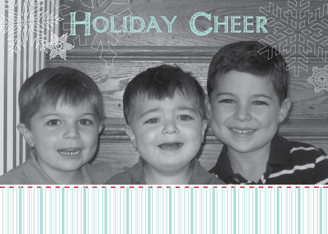
disappoint. We designed this sweet ditty that everyone really loved. The kids, look charming, the card is heart-warming and it's the perfect holiday card to send to friends and family:
 (Side Note:)
 Sooo my best friend is Katie's sister. She had asked to see the card options to give her opinion to her sister. I had sent all the designs and then threw in this one as a joke. It didn't quite make the cut for obvious reasons:
{Outside}
{Inside}
Well unbeknownst to me, this reject was sent to Katie as well, but Katie actually really liked it and wondered why we didn't it as an option in the first place. So this year she asked for a more whimsical holiday card that leaned toward the snarkier side. Once again, we received more adorable pictures of the boys. This time they were riding on a friend's boat during the summer. Life jackets, wind blowing in the hair, captain's hat - it all screamed "nautical". Which led us to this font, Salty Dog:
Perhaps in the right situation this font wouldn't look so bad. To be honest, I'm not sure what we were thinking when we purchased it. Fun - check. Whimsical - check.
Hard to read - check. The font was just a failure right off the bat. It looked chunky, and disproportionate. When in the color red, it looks like a candy cane. (An idea for a holiday card??) So we ditched the font.
{For those of you who would like to purchase it, you can find it on myfonts.com No judging. We promise.}
To our advertising/ design friends: Yes, we know from design school to stick w/ the classics. Kitschy fonts are just that, kitschy. Don't purchase frivolous type that you'll only use for one project. Perhaps knowing the rules, we thought we could break them, but that kind of backfired.
In the end, we ended up using a much simpler font, clarendon. Here's a sneak peek of the card. We don't want to spoil it for the client, so we'll post about the final design soon.
Lesson learned? 1) We'll probably stick with our classic fonts and be a little more hesitant before purchasing such a distinct font. 2) We lost $30 down the drain. 3) We have a bad-ass candy cane font that we'll use for holiday cards next year.


I kinda like it. Makes me want hushpuppies.
ReplyDelete